Page 1 of 1
Using theme for focused list item
Posted: Wed Mar 01, 2017 12:02 pm
by MegumiSawada
Hi
I would like to use theme to make the border of list item red when the item is focused.
I have tried to use ListItem FocusedStyle but it seems not working.
How can I acheive my requirement with theme?
Theme: named #SWD
Code: Select all
Begin_Com Role(*EXTENDS #PRIM_THM)
Define_Com Class(#Prim_vs.Style) Name(#LightStyle) Borderbrush(#Brush1)
Define_Com Class(#PRIM_VS.SolidBrush) Name(#Brush1) Color(Red)
Define_Com Class(#Prim_thm.DrawStyle) Name(#ListItem) Focusedstyle(#LightStyle) Mouseoverstyle(#LightStyle)
End_Com
Web Page:
Code: Select all
Begin_Com Role(*EXTENDS #PRIM_WEB) Theme(#SWD)

Define_Com Class(#PRIM_LIST) Name(#List1) Displayposition(1) Left(8) Parent(#COM_OWNER) Tabposition(1) Top(40) Height(209) Width(657) Itemthemedrawstyle('#ListItem')
Define_Com Class(#PRIM_LIST.String) Name(#ColumnSTD_TEXT1) Columnwidth(341) Displayposition(1) Parent(#List1) Source(#STD_TEXT) Columnreadonly(False)
Define_Com Class(#STD_TEXT.Visual) Name(#STD_TEXT) Componentversion(1) Displayposition(2) Height(21) Left(8) Parent(#COM_OWNER) Tabposition(2) Top(8) Usepicklist(False) Width(569) Displayalignment(Right) Marginright(10) Editalignment(Right)

Evtroutine Handling(#Com_owner.Initialize)
Inz_List Named(#List1) Num_Entrys(5)
Endroutine

End_Com
Result
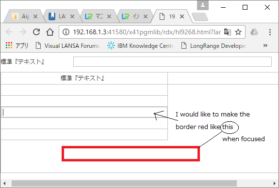
- webpage.png (24.42 KiB) Viewed 10209 times
I appreciate your kind advice for this basic question...
Best Regards,
Megumi Sawada
Re: Using theme for focused list item
Posted: Thu Mar 02, 2017 7:12 am
by jyoung
Hi Megumi,
A couple questions first, are you using a completely custom theme? Typically a theme will have a lot more components defined in it. Secondly, did you associate the theme with the page?
You can create a new theme that has all the styles already defined. Then you can modify the styles you need.
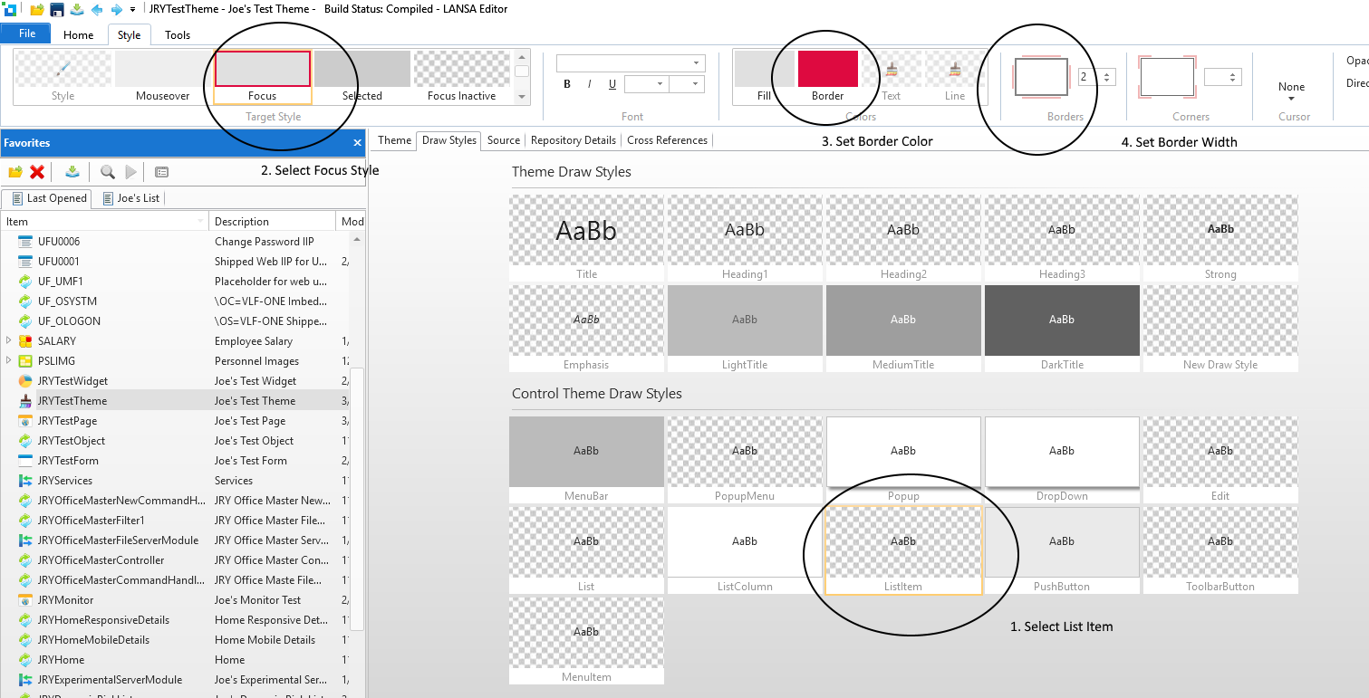
- Theme.png (207.34 KiB) Viewed 10192 times
That should give you the following code in the theme
Code: Select all
* List Item
define_com class(#PRIM_THM.DrawStyle) name(#ListItem) focusedinactivestyle(#ListItemFocusedInactiveStyle) selectedinactivestyle(#ListItemSelectedInactiveStyle) focusedstyle(#ListItemFocusStyle) mouseoverstyle(#ListItemMouseOverStyle) selectedstyle(#ListItemSelectedStyle)

define_com class(#PRIM_VS.Style) name(#ListItemFocusedInactiveStyle) borderbrush(#ListItemFocusedInactiveBorder)
define_com class(#PRIM_VS.SolidBrush) name(#ListItemFocusedInactiveBorder) color(ThemeInactive)

define_com class(#PRIM_VS.Style) name(#ListItemSelectedInactiveStyle) backgroundbrush(#ListItemSelectedInactiveBackground) borderbrush(#ListItemSelectedInactiveBorder)
define_com class(#PRIM_VS.SolidBrush) name(#ListItemSelectedInactiveBorder) color(ThemeInactive)
define_com class(#PRIM_VS.SolidBrush) name(#ListItemSelectedInactiveBackground) color(ThemeInactive)

define_com class(#PRIM_VS.Style) name(#ListItemFocusStyle) backgroundbrush(#ListItemFocusBackground) borderbrush(#ListItemFocusBorder) borderbottom(2) borderleft(2) borderright(2) bordertop(2)
define_com class(#PRIM_VS.SolidBrush) name(#ListItemFocusBorder) color(222:10:64)
define_com class(#PRIM_VS.SolidBrush) name(#ListItemFocusBackground) color(Theme100)

define_com class(#PRIM_VS.Style) name(#ListItemSelectedStyle) backgroundbrush(#ListItemSelectedBackground) borderbrush(#ListItemSelectedBorder)
define_com class(#PRIM_VS.SolidBrush) name(#ListItemSelectedBorder) color(Theme200)
define_com class(#PRIM_VS.SolidBrush) name(#ListItemSelectedBackground) color(Theme200)

define_com class(#PRIM_VS.Style) name(#ListItemMouseOverStyle) backgroundbrush(#ListItemMouseOverBackground) borderbrush(#ListItemMouseOverBorder)
define_com class(#PRIM_VS.SolidBrush) name(#ListItemMouseOverBorder) color(Theme50)
define_com class(#PRIM_VS.SolidBrush) name(#ListItemMouseOverBackground) color(Theme50)
To asscociate the theme with your page, add the theme's name to the component defintiton
Code: Select all
begin_com role(*EXTENDS #PRIM_WEB) height(488) width(769) theme(#JRYTestTheme)
Or just set the "Theme" property in the style section of the details Window.
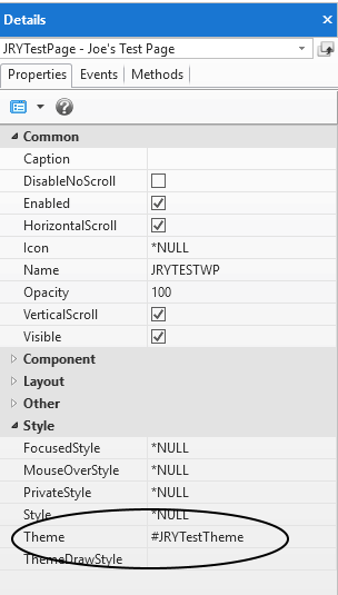
- properties.png (10.71 KiB) Viewed 10192 times
Then you should get your list item focus style.
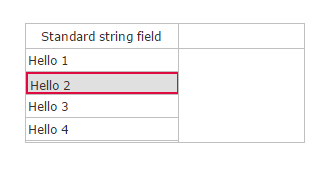
- focusitem.png (3.19 KiB) Viewed 10192 times
Hope this helps,
Joe
Re: Using theme for focused list item
Posted: Thu Mar 02, 2017 4:07 pm
by MegumiSawada
Hi Joe,
Thank you for your advice.
I've followed your instructions, but I was not able to get the expected result...
BackColor will be changed, but Border color doesn't change.
I'll keep trying. Thank you again!
Best Regards,
Megumi Sawada
Re: Using theme for focused list item
Posted: Thu Mar 02, 2017 5:27 pm
by Stewart Marshall
Hi Megumi
Border on a Prim_list list item is not currently available, so I'm surprised that Joe was been able to get something to work.
To make borders work effectively would require a significant increase in the complexity of the HTML generated for each cell and item and this would significantly impact performance.
There are a couple of alternatives.
If you're only using a single column you could use a reusable part with appropriate styling or you could use Prim_tree instead.
Regards
Re: Using theme for focused list item
Posted: Thu Mar 02, 2017 5:36 pm
by MegumiSawada
Hi Stewart,
Thank you for your advice.
I've just found out that before applying EPC141010(i.e. at EPC141006 level) list item could have red border. Maybe accidentally...
I'll use reusable parts with appropriate styling instead.
Best Regards,
Megumi Sawada
Re: Using theme for focused list item
Posted: Fri Mar 03, 2017 1:17 am
by jyoung
Hi Stewart.
Hmm, I did not know this was not supposed to be possible. Perhaps I misunderstood Megmui's question.
I am on V14SP1 EPC 141006.
Maybe I did something wrong? I have a test page and test theme that I use. Here is the complete code of both.
Web Page (note it has my history testing in it)
Code: Select all
begin_com role(*EXTENDS #PRIM_WEB) height(488) width(769) theme(#JRYTestTheme)
define_com class(#prim_labl) name(#Label1) caption('Panel1') displayposition(3) left(32) parent(#COM_OWNER) tabposition(3) top(64) tabstop(False) themedrawstyle('LightTitle') height(34) width(209) alignment(Center) verticalalignment(Center)
define_com class(#prim_labl) name(#Label2) caption('Panel2') displayposition(2) left(32) parent(#COM_OWNER) tabposition(2) top(104) tabstop(False) themedrawstyle('LightTitle') height(34) width(209) alignment(Center) verticalalignment(Center)
define_com class(#prim_labl) name(#Label3) caption('Panel3') displayposition(1) left(32) parent(#COM_OWNER) tabposition(1) top(144) tabstop(False) themedrawstyle('LightTitle') height(34) width(209) alignment(Center) verticalalignment(Center)
define_com class(#PRIM_LIST) name(#List1) displayposition(4) left(417) parent(#COM_OWNER) tabposition(4) top(177)
define_com class(#PRIM_LIST.String) name(#ColumnSTD_STRNG1) displayposition(1) parent(#List1) source(#STD_STRNG)

define_com class(#prim_kcol<#prim_labl #xDemoCaption>) name(#Labels) style(Collection)

evtroutine handling(#Com_owner.CreateInstance)

for each(#Member) in(#Com_owner.ComponentMembers) operation(*Instance_of #prim_labl)

#Labels<#Member.Caption.UpperCase> <= #Member

endfor

#STD_INT := 1
dountil cond(#STD_INT > 5)
#STD_STRNG := "Hello " + #STD_INT.AsString
add_entry to_list(#List1)
* #List1.CurrentItem.ThemeDrawStyle := DrawStyle1
#STD_INT += 1
enduntil

endroutine

evtroutine handling(#Labels<>.Click) com_sender(#Sender)

#Com_owner.AddHistory( #Sender.Caption )

endroutine

mthroutine name(AddHistory)
define_map for(*Input) class(#Prim_Alph) name(#Panel)

define_com class(#Prim_alph) name(#QueryString)

for each(#Parameter) in(#sys_web.URLParameters)
continue if(#Parameter.Name.UpperCase = Panel)

if (#QueryString <> "")
#QueryString += "&"
endif

#QueryString += #Parameter.Name + "=" + #Parameter.Value

endfor

#QueryString += "&Panel" + "=" + #Panel

#sys_web.History.Add( #QueryString )

endroutine

evtroutine handling(#sys_web.URLChanged)

#Labels<>.ThemeDrawStyle := LightTitle

if (#sys_web.URLParameters<Panel> *IsNot *null)

#Labels<#sys_web.URLParameters<Panel>.Value.UpperCase>.ThemeDrawStyle := DarkTitle

endif

endroutine

end_com
Theme
Code: Select all
begin_com role(*EXTENDS #PRIM_THM) style(#ThemeStyle)

define_com class(#PRIM_VS.Style) name(#ThemeStyle) facename('Verdana') fontsize(12) fontunits(Pixel) textcolor(48:48:48)

* C O N T R O L   D R A W S T Y L E S

* MenuBar
define_com class(#PRIM_THM.DrawStyle) name(#MenuBar) style(#MenuBarStyle)

define_com class(#PRIM_VS.Style) name(#MenuBarStyle) backgroundbrush(#MenubarBackgroundBrush)
define_com class(#PRIM_VS.SolidBrush) name(#MenubarBackgroundBrush) color(Theme300)


* PopupMenu
define_com class(#PRIM_THM.DrawStyle) name(#PopupMenu)

define_com class(#PRIM_VS.Style) name(#PopupMenuStyle) backgroundbrush(#PopupMenuBackground) borderbottom(1) borderright(1) borderleft(1) bordertop(1) cornerbottomleft(0) cornerbottomright(0) cornertopleft(0) cornertopright(0) borderbrush(#PopupMenuBorder) effect(#PopupMenuDropShadow)
define_com class(#PRIM_VS.SolidBrush) name(#PopupMenuBorder) color(ThemeBorder)
define_com class(#PRIM_VS.SolidBrush) name(#PopupMenuBackground) color(White)
define_com class(#PRIM_VS.DropShadow) name(#PopupMenuDropShadow)


* Popup
define_com class(#PRIM_THM.DrawStyle) name(#Popup) style(#PopupStyle)

define_com class(#PRIM_VS.Style) name(#PopupStyle) backgroundbrush(#PopupBackground) borderbottom(1) borderright(1) borderleft(1) bordertop(1) cornerbottomleft(0) cornerbottomright(0) cornertopleft(0) cornertopright(0) borderbrush(#PopupBorder) effect(#PopupDropShadow)
define_com class(#PRIM_VS.SolidBrush) name(#PopupBorder) color(ThemeBorder)
define_com class(#PRIM_VS.SolidBrush) name(#PopupBackground) color(White)
define_com class(#PRIM_VS.DropShadow) name(#PopupDropShadow)


* DropDown
define_com class(#PRIM_THM.DrawStyle) name(#DropDown) style(#DropDownStyle)

define_com class(#PRIM_VS.Style) name(#DropDownStyle) backgroundbrush(#DropDownBackground) borderbottom(1) borderright(1) borderleft(1) bordertop(1) cornerbottomleft(0) cornerbottomright(0) cornertopleft(0) cornertopright(0) borderbrush(#DropDownBorder) effect(#DropDownDropShadow)
define_com class(#PRIM_VS.SolidBrush) name(#DropDownBorder) color(ThemeBorder)
define_com class(#PRIM_VS.SolidBrush) name(#DropDownBackground) color(White)
define_com class(#PRIM_VS.DropShadow) name(#DropDownDropShadow)


* Edit
define_com class(#PRIM_THM.DrawStyle) name(#Edit)


* List
define_com class(#PRIM_THM.DrawStyle) name(#List)


* ListColumn
define_com class(#PRIM_THM.DrawStyle) name(#ListColumn) style(#ListColumnStyle)

define_com class(#PRIM_VS.Style) name(#ListColumnStyle) backgroundbrush(#ListColumnBackground) borderbottom(1) borderright(1) borderbrush(#ListColumnBorder)
define_com class(#PRIM_VS.SolidBrush) name(#ListColumnBorder) color(ThemeBorder)
define_com class(#PRIM_VS.SolidBrush) name(#ListColumnBackground) color(White)


* List Item
define_com class(#PRIM_THM.DrawStyle) name(#ListItem) focusedinactivestyle(#ListItemFocusedInactiveStyle) selectedinactivestyle(#ListItemSelectedInactiveStyle) focusedstyle(#ListItemFocusStyle) mouseoverstyle(#ListItemMouseOverStyle) selectedstyle(#ListItemSelectedStyle)

define_com class(#PRIM_VS.Style) name(#ListItemFocusedInactiveStyle) borderbrush(#ListItemFocusedInactiveBorder)
define_com class(#PRIM_VS.SolidBrush) name(#ListItemFocusedInactiveBorder) color(ThemeInactive)

define_com class(#PRIM_VS.Style) name(#ListItemSelectedInactiveStyle) backgroundbrush(#ListItemSelectedInactiveBackground) borderbrush(#ListItemSelectedInactiveBorder)
define_com class(#PRIM_VS.SolidBrush) name(#ListItemSelectedInactiveBorder) color(ThemeInactive)
define_com class(#PRIM_VS.SolidBrush) name(#ListItemSelectedInactiveBackground) color(ThemeInactive)

define_com class(#PRIM_VS.Style) name(#ListItemFocusStyle) backgroundbrush(#ListItemFocusBackground) borderbrush(#ListItemFocusBorder) borderbottom(2) borderleft(2) borderright(2) bordertop(2)
define_com class(#PRIM_VS.SolidBrush) name(#ListItemFocusBorder) color(222:10:64)
define_com class(#PRIM_VS.SolidBrush) name(#ListItemFocusBackground) color(Theme100)

define_com class(#PRIM_VS.Style) name(#ListItemSelectedStyle) backgroundbrush(#ListItemSelectedBackground) borderbrush(#ListItemSelectedBorder)
define_com class(#PRIM_VS.SolidBrush) name(#ListItemSelectedBorder) color(Theme200)
define_com class(#PRIM_VS.SolidBrush) name(#ListItemSelectedBackground) color(Theme200)

define_com class(#PRIM_VS.Style) name(#ListItemMouseOverStyle) backgroundbrush(#ListItemMouseOverBackground) borderbrush(#ListItemMouseOverBorder)
define_com class(#PRIM_VS.SolidBrush) name(#ListItemMouseOverBorder) color(Theme50)
define_com class(#PRIM_VS.SolidBrush) name(#ListItemMouseOverBackground) color(Theme50)


* Push Button
define_com class(#PRIM_THM.DrawStyle) name(#PushButton) style(#PushButtonStyle) mouseoverstyle(#PushButtonMouseover) focusedstyle(#PushButtonFocused) pressedstyle(#PushButtonPressed)

define_com class(#PRIM_VS.Style) name(#PushButtonStyle) backgroundbrush(#PushButtonBackground) borderbottom(1) borderleft(1) borderright(1) bordertop(1) borderbrush(#PushButtonBorder) cornerbottomleft(0) cornerbottomright(0) cornertopleft(0) cornertopright(0)
define_com class(#PRIM_VS.SolidBrush) name(#PushButtonBackground) color(234:234:234)
define_com class(#PRIM_VS.SolidBrush) name(#PushButtonBorder) color(Silver)

define_com class(#PRIM_VS.Style) name(#PushButtonMouseover) backgroundbrush(#PushButtonMouseoverBackground)
define_com class(#PRIM_VS.SolidBrush) name(#PushButtonMouseoverBackground) color(Theme200)

define_com class(#PRIM_VS.Style) name(#PushButtonFocused) backgroundbrush(#PushButtonFocusBackground) borderbrush(#PushButtonFocusBorder)
define_com class(#PRIM_VS.SolidBrush) name(#PushButtonFocusBackground) color(Theme200)
define_com class(#PRIM_VS.SolidBrush) name(#PushButtonFocusBorder) color(Theme300)

define_com class(#PRIM_VS.Style) name(#PushButtonPressed) backgroundbrush(#PushButtonPressedBackground)
define_com class(#PRIM_VS.SolidBrush) name(#PushButtonPressedBackground) color(Theme300)


* ToolbarButton
define_com class(#PRIM_THM.DrawStyle) name(#ToolbarButton) mouseoverstyle(#ToolbarButtonMouseover) focusedstyle(#ToolbarButtonFocused) pressedstyle(#ToolbarButtonPressed)

define_com class(#PRIM_VS.Style) name(#ToolbarButtonMouseover) backgroundbrush(#ToolbarButtonMouseoverBackground)
define_com class(#PRIM_VS.SolidBrush) name(#ToolbarButtonMouseoverBackground) color(Theme200)

define_com class(#PRIM_VS.Style) name(#ToolbarButtonFocused) backgroundbrush(#ToolbarButtonFocusBackground) borderbrush(#ToolbarButtonFocusBorder)
define_com class(#PRIM_VS.SolidBrush) name(#ToolbarButtonFocusBackground) color(Theme200)
define_com class(#PRIM_VS.SolidBrush) name(#ToolbarButtonFocusBorder) color(Theme300)

define_com class(#PRIM_VS.Style) name(#ToolbarButtonPressed) backgroundbrush(#ToolbarButtonPressedBackground)
define_com class(#PRIM_VS.SolidBrush) name(#ToolbarButtonPressedBackground) color(Theme300)


* Menu Item
define_com class(#PRIM_THM.DrawStyle) name(#MenuItem) mouseoverstyle(#MenuItemMouseOver)

define_com class(#PRIM_VS.Style) name(#MenuItemMouseOver) backgroundbrush(#MenuItemMouseBackground)
define_com class(#PRIM_VS.SolidBrush) name(#MenuItemMouseBackground) color(Theme200)


* D R A W   S T Y L E S

* Title
define_com class(#PRIM_THM.DrawStyle) name(#Title) style(#TitleStyle)

define_com class(#PRIM_VS.Style) name(#TitleStyle) foregroundbrush(#TitleStyleForeground) fontsize(250) fontunits(Percent)
define_com class(#PRIM_VS.SolidBrush) name(#TitleStyleForeground) color(Theme900)


* Heading1
define_com class(#PRIM_THM.DrawStyle) name(#Heading1) style(#Heading1Style)

define_com class(#PRIM_VS.Style) name(#Heading1Style) foregroundbrush(#Heading1Foreground) fontsize(160) fontunits(Percent)
define_com class(#PRIM_VS.SolidBrush) name(#Heading1Foreground) color(Theme900)


* Heading2
define_com class(#PRIM_THM.DrawStyle) name(#Heading2) style(#Heading2Style)

define_com class(#PRIM_VS.Style) name(#Heading2Style) foregroundbrush(#Heading2Foreground) fontsize(140) fontunits(Percent)
define_com class(#PRIM_VS.SolidBrush) name(#Heading2Foreground) color(Theme900)


* Heading3
define_com class(#PRIM_THM.DrawStyle) name(#Heading3) style(#Heading3Style)

define_com class(#PRIM_VS.Style) name(#Heading3Style) foregroundbrush(#Heading3Foreground) fontsize(120) fontunits(Percent)
define_com class(#PRIM_VS.SolidBrush) name(#Heading3Foreground) color(Theme900)


* Strong
define_com class(#PRIM_THM.DrawStyle) name(#Strong) style(#StrongStyle)

define_com class(#PRIM_VS.Style) name(#StrongStyle) bold(True)


* Emphasis
define_com class(#PRIM_THM.DrawStyle) name(#Emphasis) style(#EmphasisStyle)

define_com class(#PRIM_VS.Style) name(#EmphasisStyle) italic(True)


* Light Title
define_com class(#PRIM_THM.DrawStyle) name(#LightTitle) style(#LightTitleStyle)

define_com class(#PRIM_VS.Style) name(#LightTitleStyle) backgroundbrush(#LightTitleBackground) foregroundbrush(#LightTitleForeground)
define_com class(#PRIM_VS.SolidBrush) name(#LightTitleBackground) color(Theme300)
define_com class(#PRIM_VS.SolidBrush) name(#LightTitleForeground) color(Theme700)


* Medium Title
define_com class(#PRIM_THM.DrawStyle) name(#MediumTitle) style(#MediumTitleStyle)

define_com class(#PRIM_VS.Style) name(#MediumTitleStyle) foregroundbrush(#MediumTitleForeground) backgroundbrush(#MediumTitleBackground)
define_com class(#PRIM_VS.SolidBrush) name(#MediumTitleBackground) color(Theme500)
define_com class(#PRIM_VS.SolidBrush) name(#MediumTitleForeground) color(White)


* Dark Title
define_com class(#PRIM_THM.DrawStyle) name(#DarkTitle) style(#DarkTitleStyle)

define_com class(#PRIM_VS.Style) name(#DarkTitleStyle) backgroundbrush(#DarkTitleBackground) foregroundbrush(#DarkTitleForeground)
define_com class(#PRIM_VS.SolidBrush) name(#DarkTitleForeground) color(White)
define_com class(#PRIM_VS.SolidBrush) name(#DarkTitleBackground) color(Theme700)

define_com class(#PRIM_THM.DrawStyle) name(#DrawStyle1) style(#Style1)
define_com class(#PRIM_VS.Style) name(#Style1) backgroundbrush(#Brush1) borderbottom(2) borderbrush(#Brush2) borderleft(2) borderright(2) bordertop(2)
define_com class(#PRIM_VS.SolidBrush) name(#Brush2) color(222:10:64)
define_com class(#PRIM_VS.SolidBrush) name(#Brush1) color(21:221:255)

end_com
I was able to get a red border on a list item without any problems.